Introducing Server Cards: See Your Entire SQL Server Estate at a Glance
If you manage more than a handful of SQL Server instances, you already know the challenge with dense data tables.
You open your monitoring tool. You get a table of server names with columns of numbers. The data is all there - but you’re scanning rows, comparing figures, and mentally translating numbers into meaning. A server with a 2-hour blocking chain sits next to one that’s been quietly idle all morning, and they both look like rows in a spreadsheet.
We’ve had a powerful table view in SQLWATCH for a long time, and it’s not going anywhere - it’s great for sorting, comparing, and working with precise values. But for operations teams who need to monitor many servers simultaneously and spot problems at a glance, we’re adding a complementary option. Meet Server Cards.
A Different Way to See the Same Data
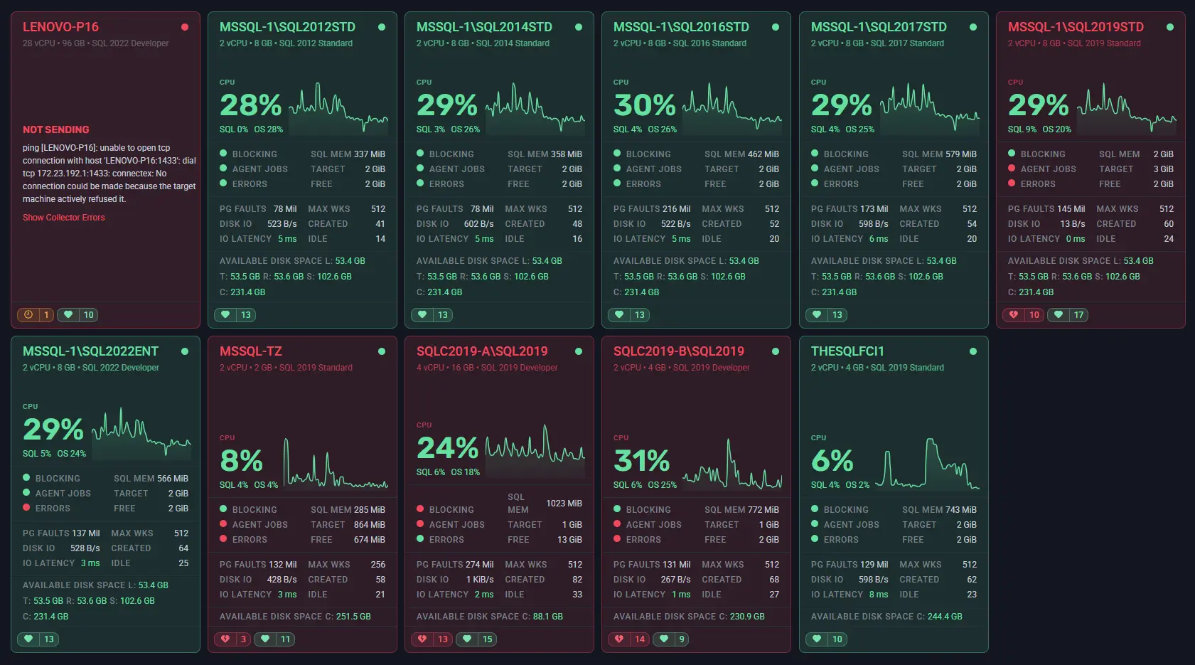
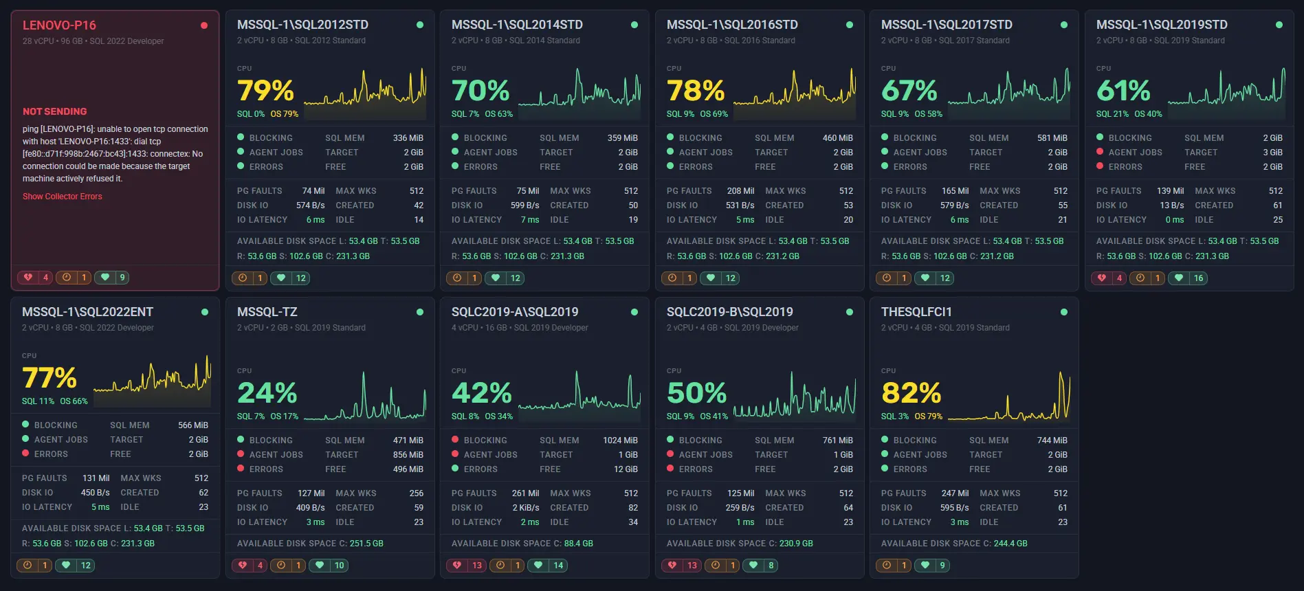
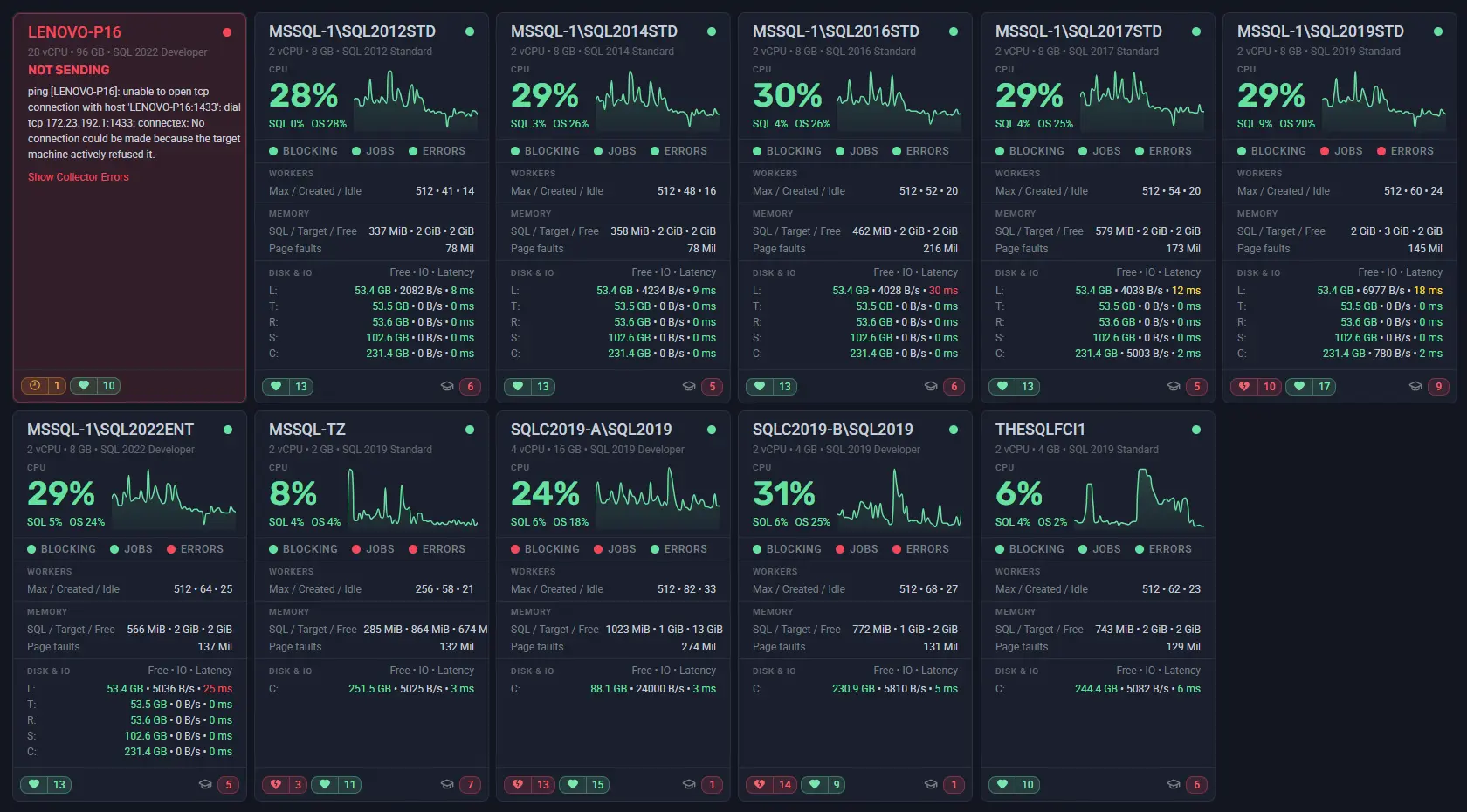
Server Cards presents your SQL Server estate as a live grid of visual tiles - one card per monitored instance. All the same metrics available in the table view are here, but laid out so that visual weight does more of the communication. Healthy servers sit quietly. Servers that need attention are hard to miss.
Take a real example from the view: one card in a grid of a dozen servers shows BLOCKING: 2.97 hours. In the table that information is present too - but in Server Cards, the visual layout makes it stand out the moment you open the dashboard, without scanning columns or sorting rows.
This makes Server Cards particularly well suited to NOC-style operations, wall monitors, or anyone who keeps a second screen open as a live health check while working on other things. The table view remains the right choice when you need to sort by a specific metric, export data, or work through a structured checklist.
What’s on Each Card
Every card gives you a consistent snapshot of that server’s current health:
- Status indicator - a colour-coded dot in the top corner. Green means data is flowing and the server looks healthy. Red means something is wrong or the server has stopped reporting.
- Total CPU % - shown large and clearly, with a sparkline graph of recent history so you can see at a glance whether it’s stable, climbing, or just spiked.
- SQL vs OS CPU split - because 36% total CPU means very different things depending on whether SQL Server is responsible for 4% of it or 34%.
- Blocking elapsed time - the duration of the longest active blocking chain, if one exists. Zero is what you want to see. Anything measured in minutes - or hours - is not.
- Wait time - average wait per request, giving you a quick read on whether queries are queuing.
- Disk I/O - combined read and write throughput, so you can spot unexpected disk pressure without digging into individual counters.
- Alert counts - at the bottom of each card, a summary of active and acknowledged alerts so you know the signal-to-noise ratio at a glance.
And if a server has stopped sending data entirely? The card tells you that too - clearly, in red - rather than simply disappearing from view or going silently stale.
Two Card Styles
Server Cards comes in two layout styles, and you can switch between them at any time.
Style 1 is a responsive, adaptive layout. The card adjusts what it shows based on how much space is available - at larger sizes you get the full picture, at smaller sizes the most important metrics stay visible and less critical detail steps back. It’s designed to work well across a wide range of card sizes without feeling cramped or wasteful.
Style 2 uses a fixed vertical structure with clearly labelled sections: CPU, Workers, Memory, and Disk & IO. Everything is always in the same place, which makes it easier to scan across multiple cards when you know exactly where to look for a specific metric.
Neither style is better - it depends on your preference and how you use the view. Try both and see which one fits the way you work.
Control How Many Servers Fit on Screen
Server Cards lets you adjust card size to suit the number of servers you’re monitoring and the screen you’re working on.
Set cards smaller and you get maximum density - every server in your estate visible at once with their most critical metrics. This is the setting that works best on a wall monitor or when you have dozens of instances to keep an eye on simultaneously.
Set cards larger and each one has more room to breathe - sparklines are easier to read, metric breakdowns are clearer, and it’s easier to focus on a specific group of servers in more detail.
The right card size depends on your screen, your team, and how many servers you manage. It’s a quick adjustment, and you’ll find the setting that works for you in seconds.
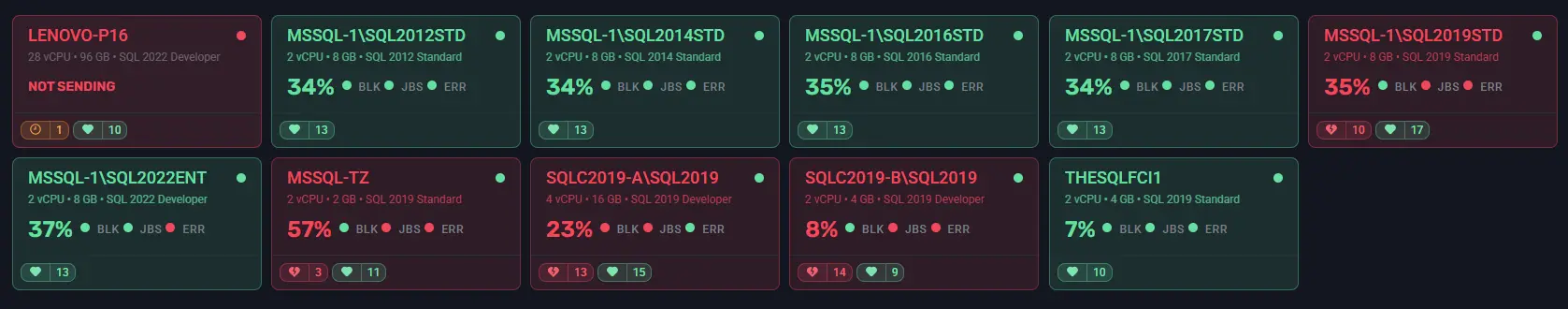
Dynamic Background: Alert State at a Glance
One of the more useful options in Server Cards is the dynamic background. When enabled, each card’s background colour reflects the current alert state of that server - so you don’t have to read the alert count to know something is wrong.
The effect is immediate. In a grid of a dozen servers, a card that has gone red stands out before you’ve consciously looked for it. Combined with the compact card size, this makes Server Cards a practical choice for a NOC display or any situation where you need ambient awareness of your estate without actively watching it.
You can choose between a subtle tint or a full solid background depending on how prominent you want the alert state to be.
Filtering Works the Same Way It Always Has
Filtering in SQLWATCH applies at the dashboard level, so everything you already know about filtering by workspace, environment, and SQL instance works exactly the same way with Server Cards. Narrow the view to just production, a specific region, or the instances you’re responsible for - and the card grid updates instantly.
This makes both the table view and Server Cards genuinely useful for teams. A developer filters to their development instances. An on-call engineer focuses on production. A manager looks across the whole estate. The filtering behaviour is consistent regardless of which view you prefer.
Try It Now
Server Cards is available now in SQLWATCH Cloud as a library panel. Add it to any existing dashboard, or create a new one - the pre-built panel is ready to drop in. You can run it alongside the table view on the same dashboard if you want both at once.
Not a customer yet? Get in touch for a free trial or demo.